hello!
I'm Chris Spiteri.
A game artist and graphic designer specializing in game-related iconography, user interface design, and making things pretty.
quick navigation
TRUSTED BY THE LOVELY PEOPLE AT:
2025 // Chris Spiteri
Developed with love in Port Colborne, ON
Portfolios By Discipline:
a little about me...
I'm a logo guy. You could say I've got something of a passion for semiotics, getting points across with pictures. As a game designer, I'm at my most engaged when exploring the intersection between gameplay, imagery, and feelings. It's why I've found my niche within game and studio branding, as well as interface design and 2D illustration.
I also dabble in 3D modelling and texturing for props and characters, as well as 2D and 3D animation!
When I'm not working on a project, you can probably find me:- hunting for an old video game or vinyl / cassette.- reading 19th/20th century science fiction.- grilling!

Illustration, Modelling, and Rendering promo and packaging materials for Jukebox The Ghost's seventh studio album.
2024
Players: 2
Genre: Asymmetric Co-Op Runner + Microgames
2024 - 2025
Players: 2
Genre: Asymmetric Versus Chase Game
User Interface
User experience is something I care a lot about. I think it starts with a great interface.I've had the pleasure of working at nearly every stage of UI/UX development, from designing flow, to concepting, to iterating, implementation, to testing, to polishing!Here's some of the work that I've done in a few of my projects:
GREEN THING
FROM THE PLANET
JUPITER
A concern when designing the UI for Green Thing From The Planet Jupiter was the location on the screen of information that is pertinent to both players. In the initial concept, Green Thing's remaining lives and the amount of parts he had collected to repair his ship both occupied the middle of the screen, where, I believed, both players would be happily able to reference them!That was, until we grew wary of screen peeking, and I become worried that encouraging both players to look at a shared space on the screen might not be ideal. And so, we came up with the scoreboard solution. In the second iteration, you'll see at the top that both characters have a scoreboard which directly outlines their progress towards their win state. However, in the innermost bottom corners, both players also have an indicator for the other player's progress as well.This means that all relevant player information is conveyed to both players on their respective side of the screen. Although we later determined that screen peeking wasn't an issue in this particular title, I still find this to be a neat thing we took into consideration.
REVEREX
In REVEREX, the two players' computer screen takes on the role of the titular machine, designed to pull people out of comas.The game essentially being one massive diegetic UI piece for itself came with a couple of interesting design challenges; namely how to have both players' experiences feel meaningful with such little screen real estate.Below is the evolution. Note the push and pull on the size of the Navigator (left)'s screen compared to the Vitalist (right).
Branding
In my time working on small-scale projects, I've discovered the importance of team identity. Having a name, but especially a logo or symbol to rally around goes such a long way in keeping people motivated, or believing in a project. That's why I make a point of doing it early for every game project I work on.I design logos as a contract side hustle, too!
Illustration
Digital illustration is another passion of mine, and I'm keen on leveraging it wherever I can in game projects, from enhancing 3D objects, to creating vivid, memorable UI, to creating promotional material. Here's some examples from my previous work!
GREEN THING
FROM THE PLANET
JUPITER
Green Thing From The Planet Jupiter is a game that is almost as 2D art-intensive as it is 3D art-intensive. The following are some of my proudest illustrations from the project.

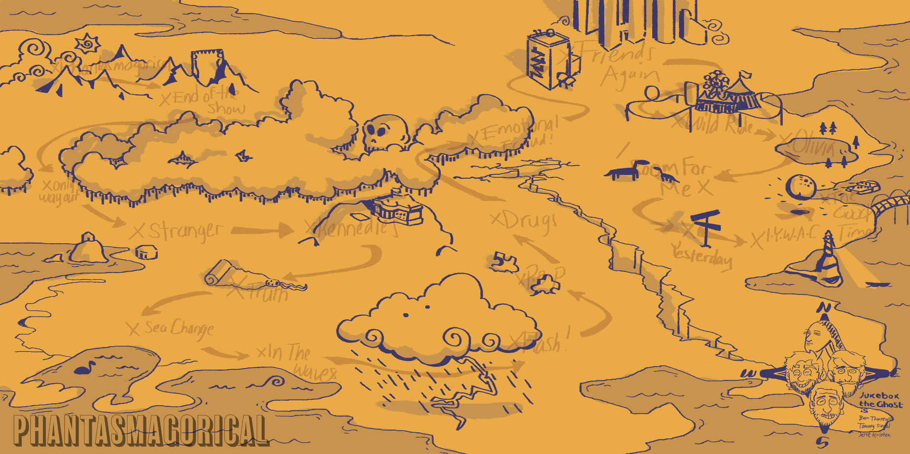
While producing their seventh album, PHANTASMAGORICAL VOL. 1,
indie piano-rock band Jukebox The Ghost put out a call for 2D illustrators to work on an unspecified map graphic for an upcoming project. After sending a portfolio in, I was tapped for the role.
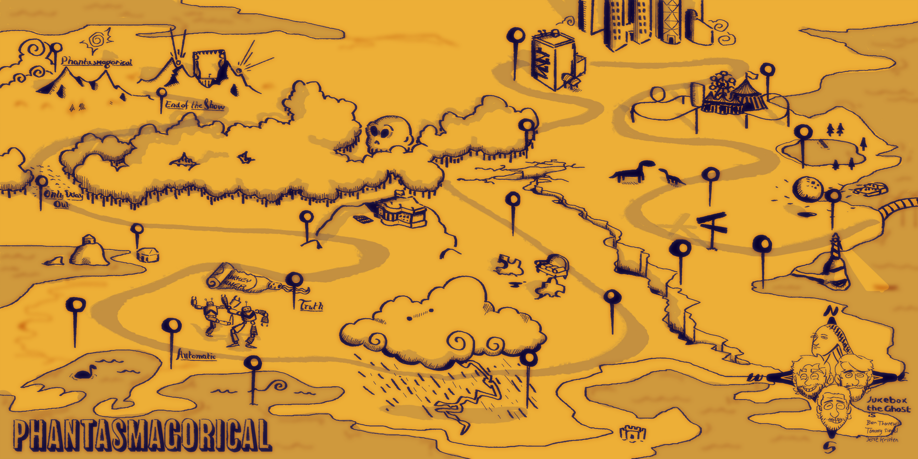
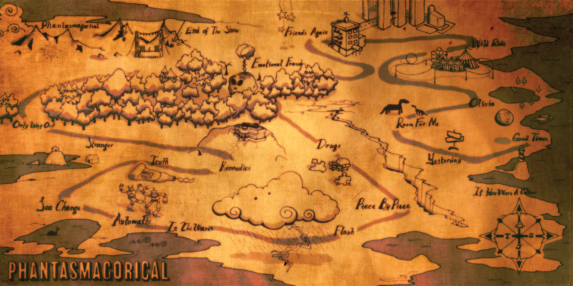
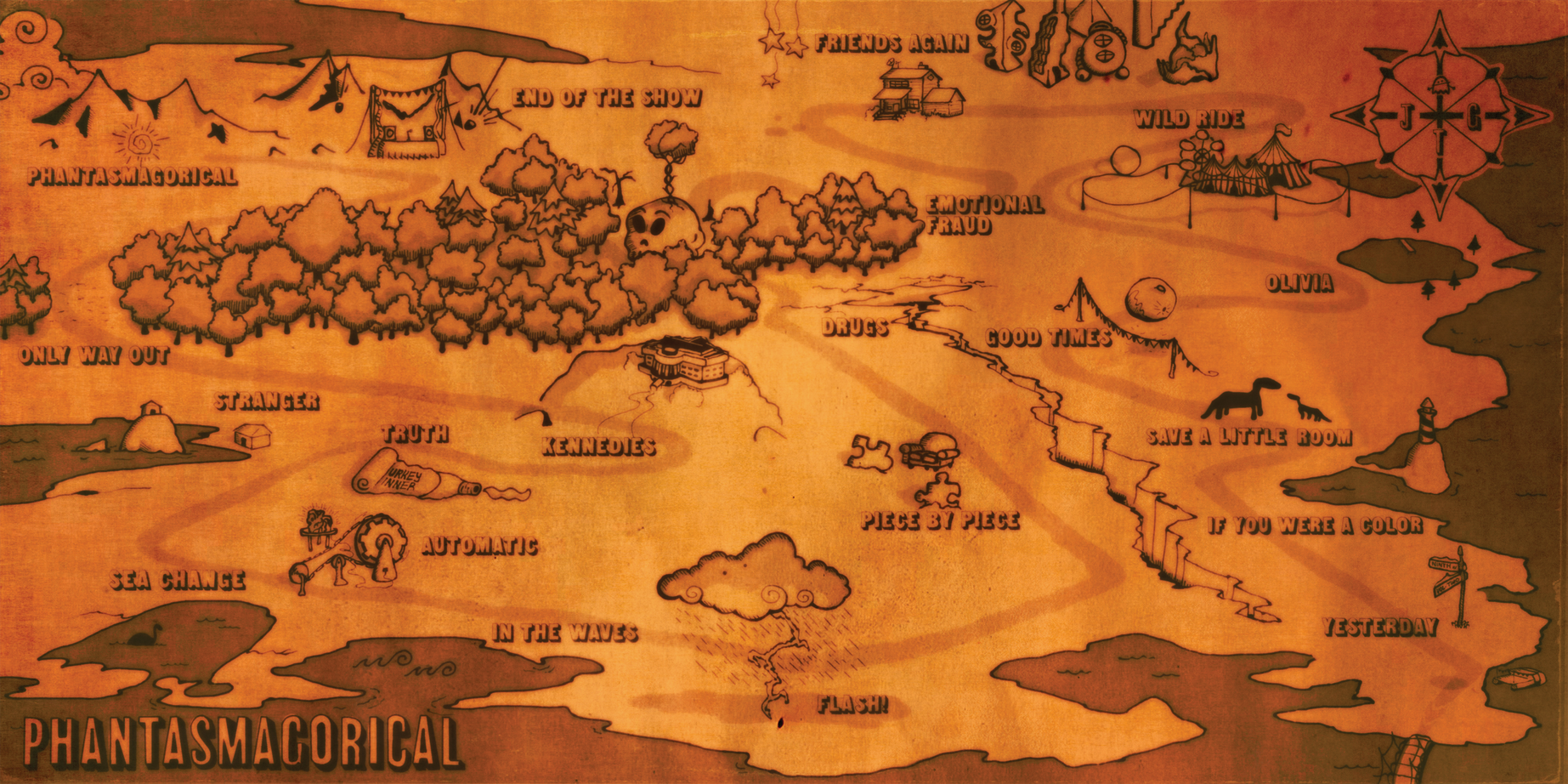
The idea was to design a map that would act both as a tracklist, and as a captivating gatefold illustration for this album, featuring a setpiece for each track, with a sense of connectivity between them. Creating the geographical mass of "Phantasmagoria" as well as working with the band to finalize setpieces, locations, and continuity was a very fulfilling creating exercise! Creating the texture, lighting, ink-bleed look, and post-processing was an interesting challenge but it's one I'm super proud to have tackled. See the evolution below!

First Pass, experimenting with setpiece size, path flow, and general style.

Second iteration, tweaks to setpieces, solidified path.

Third iteration! Paper texture in the works, ink simulation process solidified, Preliminary lettering completed.

The final version! Order of final 4 songs adjusted, VOL 2 transition point changed to bottom right, scaling and reworking of certain setpieces, new lettering, colour grading!
In addition, I was contracted to create a 3D version of the map and animate a flyover for the band to use on their socials. Please find it below.
